Headlines
Masterclass: Frame Design
18 February 2021
Lockdown wasn’t easy for any of us and I’m sure that things have been tough for many framers. However, one positive has been the growth of webinars; giving us the opportunity to attend seminars or workshops without the need to travel. This article is based on one of the webinars I produced for Larson-Juhl. I’ve cut down on the content considerably, so as not to fill this whole edition of 4Walls. The entire presentation can be viewed via Larson-Juhl’s website (link).
Considering that design is arguably the most important aspect of framing, it’s surprising that there isn’t that much written on it. The framing books I regularly refer to skim over design in a few paragraphs. Magazine articles, social media posts and other reference material is either very general or very specific and only applicable to certain scenarios. Either way, exceptions to these rules can easily be found.
I want to examine apparent design rules, standard practices and frame designs that don’t follow those rules. My intent is to question preconceptions and, therefore, I don’t expect you to be in constant agreement with me. However, I hope that the designs chosen prove thought provoking and provide inspiration.
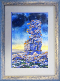
I have read, on more than one occasion, that a strong coloured bottom mount of over 5mm on a double mount design will overwhelm the artwork. This is true in certain scenarios, but shouldn’t the proportions of the mount, including the bottom mount, increase in proportion with the size of the artwork? In some cases, the answer must be yes.
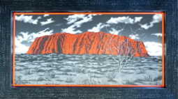
This dominating effect by the bottom mount can sometimes be overcome by increasing the white space around the artwork. In other words, the bottom mount is ‘distanced’ from the image. In Picture 1, this additional white space has been highlighted by the white of the V-groove. I would have to conclude that the amount of a strong coloured bottom mount which should be displayed depends on the balance and proportions of other aspects of the frame design.

Picture 1.
The same distancing technique can also allow the use of mounts that don’t quite match the artwork. By using a bottom mount that matches an aspect of the artwork very well, other not quite matching mounts can be used. Were those mounts directly against the artwork we would see that they were wrong. To see an example of this in practice, do watch the full webinar.
A rarely questioned rule of frame design is that we should design with mount and frame colours that are close to the colours of the art work and/or neutral colours. Picture 2 shows the use of a combination of neutral and matching colours. A neutral grey undermount has been used to enhance the three shirts, while the three top mounts have been chosen to match their specific colours. Stacked grey mouldings have been used to balance the whole design.
Picture 2
Having just said that ‘we should design with mount and frame colours that are as close to the colours of the artwork as possible and/or neutral colours’ let’s question that rule!
In other forms of design, the contrasting colours of a tertiary colour wheel are regularly used to come up with balanced harmonious designs (Pictures 3 & 4). However, I have yet to see an example of frame design where colours that contrast with the artwork have been used. As an experiment, I came up with a design using contrasting colours (Picture 5). What do you think, could they work in the right circumstances? During the webinar viewers’ opinions were very much divided. Some people suggested that a third colour needs to be added for balance but there are well known examples, such as the old Sainsbury’s logo, where just two contrasting colours have been used.
PICTURE 3
PICTURE 4
PICTURE 5
One thing I find impressive is when the texture of a moulding or mount is used to match texture within the artwork. This can be as simple as the matt finish of a mountboard or more definite such as the colour pattern or detail of a moulding. Framer Greg Perkins does this very well and I used a great example of his work in the webinar. For this Peter Reading watercolour (Picture 6), I selected a moulding whose colour and texture matches the rocks in the image so well that it appears to have been made for the artwork.
Picture 6
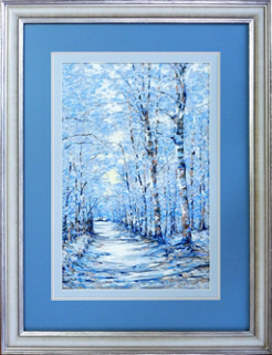
Getting back to ‘rules’. One of those more commonly expressed is that mount colours should not be stronger than the colours of the image. Is this always the case? Can there can be exceptions?
To frame the pastel in Picture 7, I chose three colours that were clearly in the artwork, including a brown which would add contrast by highlighting the bark of the trees. However, the dark blue and the brown were stronger colours than their counterparts in the picture. So, I placed the subtle light blue next to the artwork and cut it wide to help create distance between the strong mounts and the artwork. I like this, but many framers would say that the mount is too strong for the image.
Picture 7
Having said that, generally, the mount colours we use should not be stronger than the colours of the image, it would be logical to say that the bolder the artwork is, the stronger the colours in your design can be. There aren’t many pictures that wouldn’t be overwhelmed by the frame in Picture 8. Notice how the top mount matches the colour of the paper. Don’t forget that any paper that is visible is also part of the artwork. I often match paper colours, particularly for top mounts. They are less likely to dominate the artwork and customers with conservative tastes often feel more comfortable with a neutral top mount.
Picture 8
Don’t think that you need to rely on mounts to find colour matches. With this abstract image (Picture 9), the stronger, brighter colours in the artwork were all in the bottom left, so a balanced design using matching mount colours was difficult to find. White, black and gold are consistent throughout the image. I opted for a black mount and emphasised the gold with a Confetti range mount slip glued to the rebate lip of the black moulding. In other words, the artwork’s colours have been emphasised more with the mouldings than with the mount.
Picture 9
This leads to the question ‘why is it that double mounts are a standard framing design format but double mouldings are not?’ In Picture 10, the colours and proportions of the mouldings used are similar to those of a double mount i.e. a wider, more passive top colour and a narrower, brighter bottom colour - but the use of stacked mouldings means this design stands out far more than a single moulding and a double mount would.
Picture 10
This is the same double frame concept, except on a canvas (Picture 11). What do you think? Is matching the colours of the artwork using the mouldings rather than the mount a bad idea?
Picture 11
One area I don’t see much experimentation with is depth.
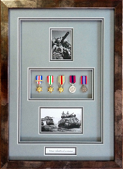
This design in Picture 12 includes a shadow mount to space the medals away from the glazing but also an additional shadow mount so that all the framed objects are set back. The position of the apertures and their varying depths, combined with the consistency of double mounts draws the eye to each element.
Picture 12
Stacking mouldings creates depth and leads the viewer into the picture much more than a single moulding. For this Parisian scene (Picture 13) I used two moulding profiles from the same range. The bevel of the first adds to the effect, drawing the viewer into the image.
Picture 13
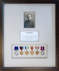
Framers often talk about balance. How we achieved balance in a design is hard to define. Each aspect of a design has to be balanced both in relation to the artwork and to every other aspect. For example the colour weight of the artwork needs to be balanced by the colour weight of the mount and frame and they need to work together to focus the viewer’s eye on the central point.
This set of medals, photograph and text box (Picture 14) are a good example. The brightness of the medals and the colour of their ribbons make them the strongest element and they could easily detract from the photograph. The text could also quite easily be lost alongside the medals and the photograph. However, the use of the subtle grey mounts complements the photograph and highlights the medals without overwhelming the text. It is the moulding that restores balance though. It matches the colours and tone of the photograph helping it hold its own against the strength of the medals.
Picture 14
There are endless aspects of frame design to explore. In the hour long webinar, we managed to examine a lot more examples than I have here in this article. Even so, we only skimmed the surface. We saw that many rules of framing design are only relevant in specific situations and that even the more general rules can have exceptions.
What should or shouldn’t be done depends on the individual piece of artwork. Introduce a new aspect of the design and the rules change, because the size, colour and texture of that new component effects all the other components. Balance, proportion, contrast and repetition are relevant to one another and achieved by the right combination of elements. Add to this the need to draw the viewer’s eye towards the artwork and possibly a hierarchy of items in a frame and the recipe for success is bound to be different almost every time.
In order to get the design recipe right we need to provide ourselves with the right tools. A source of fresh ideas is a must. There is a wealth of information on social media. I have framing books that are 35 years old and still provide me with new ideas. Also, let’s not forget framing magazines which should offer us bi-monthly inspiration.
Make time to play. Try out different ideas with colours, textures, proportions and depths. See how different ideas look and don’t be afraid to emulate other framers’ concepts. Playing is not something you can do in front of a customer, you need to be free to make mistakes and get things wrong. In other industries they call this research and development. It is vital to the continued growth of new products and ideas.
Jon Price GCF (APF) owns Handmade Framing & Gallery in North Cornwall and provides a consultancy service for professional, amateur and would be framers. He is a member of the Fine Art Trade Guild’s Framing Standards and Qualifications Committee.
www.handmadepictureframing.co.uk
Watch Jon’s full webinar here.
Considering that design is arguably the most important aspect of framing, it’s surprising that there isn’t that much written on it. The framing books I regularly refer to skim over design in a few paragraphs. Magazine articles, social media posts and other reference material is either very general or very specific and only applicable to certain scenarios. Either way, exceptions to these rules can easily be found.
I want to examine apparent design rules, standard practices and frame designs that don’t follow those rules. My intent is to question preconceptions and, therefore, I don’t expect you to be in constant agreement with me. However, I hope that the designs chosen prove thought provoking and provide inspiration.
I have read, on more than one occasion, that a strong coloured bottom mount of over 5mm on a double mount design will overwhelm the artwork. This is true in certain scenarios, but shouldn’t the proportions of the mount, including the bottom mount, increase in proportion with the size of the artwork? In some cases, the answer must be yes.
This dominating effect by the bottom mount can sometimes be overcome by increasing the white space around the artwork. In other words, the bottom mount is ‘distanced’ from the image. In Picture 1, this additional white space has been highlighted by the white of the V-groove. I would have to conclude that the amount of a strong coloured bottom mount which should be displayed depends on the balance and proportions of other aspects of the frame design.
Picture 1.
The same distancing technique can also allow the use of mounts that don’t quite match the artwork. By using a bottom mount that matches an aspect of the artwork very well, other not quite matching mounts can be used. Were those mounts directly against the artwork we would see that they were wrong. To see an example of this in practice, do watch the full webinar.
A rarely questioned rule of frame design is that we should design with mount and frame colours that are close to the colours of the art work and/or neutral colours. Picture 2 shows the use of a combination of neutral and matching colours. A neutral grey undermount has been used to enhance the three shirts, while the three top mounts have been chosen to match their specific colours. Stacked grey mouldings have been used to balance the whole design.
Picture 2
Having just said that ‘we should design with mount and frame colours that are as close to the colours of the artwork as possible and/or neutral colours’ let’s question that rule!
In other forms of design, the contrasting colours of a tertiary colour wheel are regularly used to come up with balanced harmonious designs (Pictures 3 & 4). However, I have yet to see an example of frame design where colours that contrast with the artwork have been used. As an experiment, I came up with a design using contrasting colours (Picture 5). What do you think, could they work in the right circumstances? During the webinar viewers’ opinions were very much divided. Some people suggested that a third colour needs to be added for balance but there are well known examples, such as the old Sainsbury’s logo, where just two contrasting colours have been used.
PICTURE 3PICTURE 4 PICTURE 5One thing I find impressive is when the texture of a moulding or mount is used to match texture within the artwork. This can be as simple as the matt finish of a mountboard or more definite such as the colour pattern or detail of a moulding. Framer Greg Perkins does this very well and I used a great example of his work in the webinar. For this Peter Reading watercolour (Picture 6), I selected a moulding whose colour and texture matches the rocks in the image so well that it appears to have been made for the artwork.
 Picture 6
 Getting back to ‘rules’. One of those more commonly expressed is that mount colours should not be stronger than the colours of the image. Is this always the case? Can there can be exceptions?
To frame the pastel in Picture 7, I chose three colours that were clearly in the artwork, including a brown which would add contrast by highlighting the bark of the trees. However, the dark blue and the brown were stronger colours than their counterparts in the picture. So, I placed the subtle light blue next to the artwork and cut it wide to help create distance between the strong mounts and the artwork. I like this, but many framers would say that the mount is too strong for the image.
Picture 7
Having said that, generally, the mount colours we use should not be stronger than the colours of the image, it would be logical to say that the bolder the artwork is, the stronger the colours in your design can be. There aren’t many pictures that wouldn’t be overwhelmed by the frame in Picture 8. Notice how the top mount matches the colour of the paper. Don’t forget that any paper that is visible is also part of the artwork. I often match paper colours, particularly for top mounts. They are less likely to dominate the artwork and customers with conservative tastes often feel more comfortable with a neutral top mount.

Picture 8
Don’t think that you need to rely on mounts to find colour matches. With this abstract image (Picture 9), the stronger, brighter colours in the artwork were all in the bottom left, so a balanced design using matching mount colours was difficult to find. White, black and gold are consistent throughout the image. I opted for a black mount and emphasised the gold with a Confetti range mount slip glued to the rebate lip of the black moulding. In other words, the artwork’s colours have been emphasised more with the mouldings than with the mount.
Picture 9
This leads to the question ‘why is it that double mounts are a standard framing design format but double mouldings are not?’ In Picture 10, the colours and proportions of the mouldings used are similar to those of a double mount i.e. a wider, more passive top colour and a narrower, brighter bottom colour - but the use of stacked mouldings means this design stands out far more than a single moulding and a double mount would.
 Picture 10
 This is the same double frame concept, except on a canvas (Picture 11). What do you think? Is matching the colours of the artwork using the mouldings rather than the mount a bad idea?
 Picture 11
 One area I don’t see much experimentation with is depth.
This design in Picture 12 includes a shadow mount to space the medals away from the glazing but also an additional shadow mount so that all the framed objects are set back. The position of the apertures and their varying depths, combined with the consistency of double mounts draws the eye to each element.
 Picture 12
 Stacking mouldings creates depth and leads the viewer into the picture much more than a single moulding. For this Parisian scene (Picture 13) I used two moulding profiles from the same range. The bevel of the first adds to the effect, drawing the viewer into the image.
 Picture 13
 Framers often talk about balance. How we achieved balance in a design is hard to define. Each aspect of a design has to be balanced both in relation to the artwork and to every other aspect. For example the colour weight of the artwork needs to be balanced by the colour weight of the mount and frame and they need to work together to focus the viewer’s eye on the central point.
This set of medals, photograph and text box (Picture 14) are a good example. The brightness of the medals and the colour of their ribbons make them the strongest element and they could easily detract from the photograph. The text could also quite easily be lost alongside the medals and the photograph. However, the use of the subtle grey mounts complements the photograph and highlights the medals without overwhelming the text. It is the moulding that restores balance though. It matches the colours and tone of the photograph helping it hold its own against the strength of the medals.
 Picture 14
 There are endless aspects of frame design to explore. In the hour long webinar, we managed to examine a lot more examples than I have here in this article. Even so, we only skimmed the surface. We saw that many rules of framing design are only relevant in specific situations and that even the more general rules can have exceptions.
What should or shouldn’t be done depends on the individual piece of artwork. Introduce a new aspect of the design and the rules change, because the size, colour and texture of that new component effects all the other components. Balance, proportion, contrast and repetition are relevant to one another and achieved by the right combination of elements. Add to this the need to draw the viewer’s eye towards the artwork and possibly a hierarchy of items in a frame and the recipe for success is bound to be different almost every time.
In order to get the design recipe right we need to provide ourselves with the right tools. A source of fresh ideas is a must. There is a wealth of information on social media. I have framing books that are 35 years old and still provide me with new ideas. Also, let’s not forget framing magazines which should offer us bi-monthly inspiration.
Make time to play. Try out different ideas with colours, textures, proportions and depths. See how different ideas look and don’t be afraid to emulate other framers’ concepts. Playing is not something you can do in front of a customer, you need to be free to make mistakes and get things wrong. In other industries they call this research and development. It is vital to the continued growth of new products and ideas.
Jon Price GCF (APF) owns Handmade Framing & Gallery in North Cornwall and provides a consultancy service for professional, amateur and would be framers. He is a member of the Fine Art Trade Guild’s Framing Standards and Qualifications Committee.
www.handmadepictureframing.co.uk
Watch Jon’s full webinar here.